
I gave a talk at the Women in Data Science conference in Munich hosted by Bayerischer Rundfunk.
Slides and notes:

Every field has that one book that everyone has read – or at least everyone pretends to.
In modern investigative journalism this is „Story-Based Inquiry“ by Mark Lee Hunter (in German).
If I quote Hunter freely, he defines investigative Journalism as uncovering something that was unknown before,
- either because it should be kept a secret
- or because something was hidden in complexity
Things that should be kept a secret – combined with data journalism. I am sure, at least some of you think of whistleblowsers that give masses of documents to journalists. Yes, Leaks are an important part of investigative data journalism. But: I will not talk about those leaks today.

What I will talk about is the second category: hidden in complexity
To do that, I am going to outline three published stories. All three relied heavily on data – but still, they were totally different in terms of topics, the data itself and the methods I used.
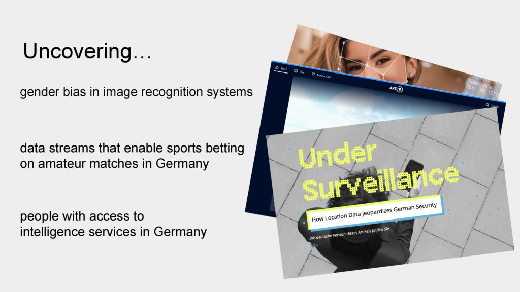
The first one is about uncovering gender bias in image recognition systems by auditing commercially distributed APIs.
The second one is about uncovering data streams that enable sports betting on amateur football matches in Germany – which is illegal at least if you bet from Germany. This was possible by finding undocumented APIs.
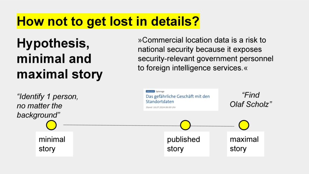
The third one is about uncovering people with access to intelligence services in Germany. We were able to do that because we had hundreds of GBs of GPS positions of smartphones. This is not only a massive privacy problem, but also one for national security.

Let’s get started with the first one story and this image: A woman in jeans and a T-shirt is sitting on a red sofa reading, with a dog lying next to her. My question to you: How sexually suggestive is this image? Rate it for yourself, let’s say … from 0 – not sexually suggestive at all – to 100 – very sexually suggestive.
We humans have taught machines to do the same.
In 2022, we tested four different image recognition systems and the results for this specific image are shown on the next slide.

Three systems said: Nope, not sexually suggestive. This is also my personal opinion. But the one from Google says: yes, very likly suggestive.
Next example:
You can see Max Osenstätter. He is a journalist with News WG, a news channel on Instagram. He stands topless in front of a wall and in the background you can see the ratings of the four systems. When I start the video, we’ll see how he puts on a bra and how the ratings are changing … and zack: The bra makes the difference – now the picture is rated by all four systems as most likely sexually suggestive.
These were two examples we used in our story. But we had more than just anecdotal evidence.

Image recognition systems are probabilistic systems – of course there will always be errors. So we collected 3000 images were from different categories: such as sports, business, underwear, leisure and so on and we labeled them so that we knew which picture was showing a man and which was showing a woman.
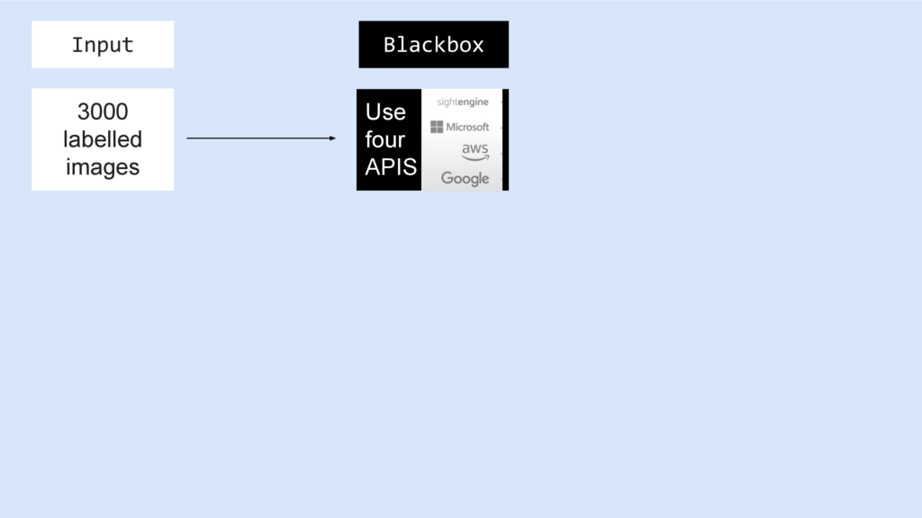
Then we sent all 3000 images to the four systems we wanted to check.
Since we don’t have access to the models or training data, these services are blackboxes for us.
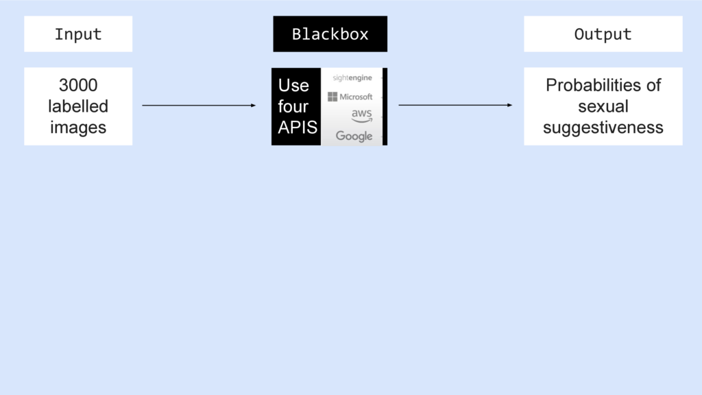
But we know the input and we can observe the output: The probability of sexual suggestiveness for each image and API.
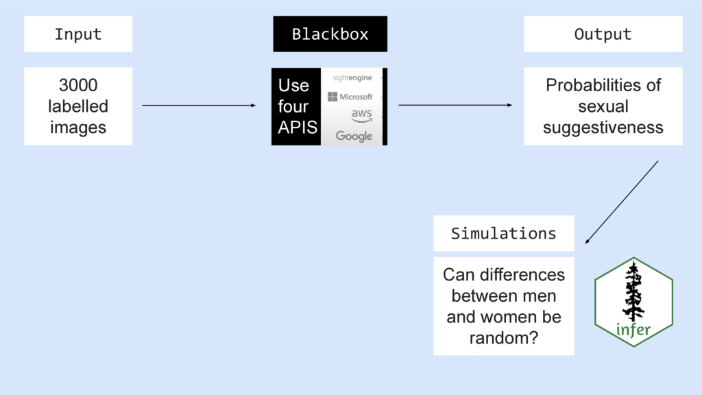
Then we used input and output for some classic hypothesis testing. We wanted to know:
Can the differences between men and women be random?
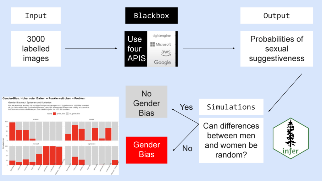
If yes – they can be random – then there is no gender bias.
If no – they can’t be random – then there is a gender bias.
Turns out: Every system has a gender bias – with varying degrees of intensity depending on the category – look at the red bars, they have different heights.
This means: Images of women have more often higher ratings for being sexually suggestive than those of men.
- Online Recherche Newsletter: Elisa Harlan and I explain the method in detail (and in German) https://sebmeineck.substack.com/p/orn-42-ki-system-statistik-adobe-enhance-tts
- Andrew Heiss: How to test any hypothesis with the infer package https://www.andrewheiss.com/blog/2018/12/05/test-any-hypothesis/
- Allen Downey: There is still only one test http://allendowney.blogspot.com/2016/06/there-is-still-only-one-test.html
Let’s move on to the second story: It’s about sportsbetting on amateur matches.

In Germany, this is forbidden. But if you visit website of bookmakers, you find many matches from the fourth or fifth football leagues in Germany. And you can bet on them – at least if you have an IP address that is not located in Germany. A classic loophole.

When you stare on sports betting websites long enough, like I did, you’ll recognize that some of them use similar visualizations: Small football fields with second-by-second updates: Where is the ball? Is there a a goal, who is attacking, ball safe and so on. And obviously they are based on the same data.
We wanted to know: Where does the data come from?
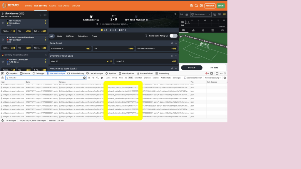
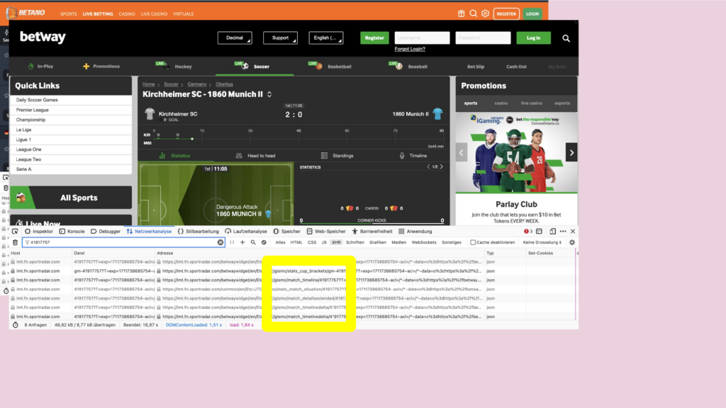
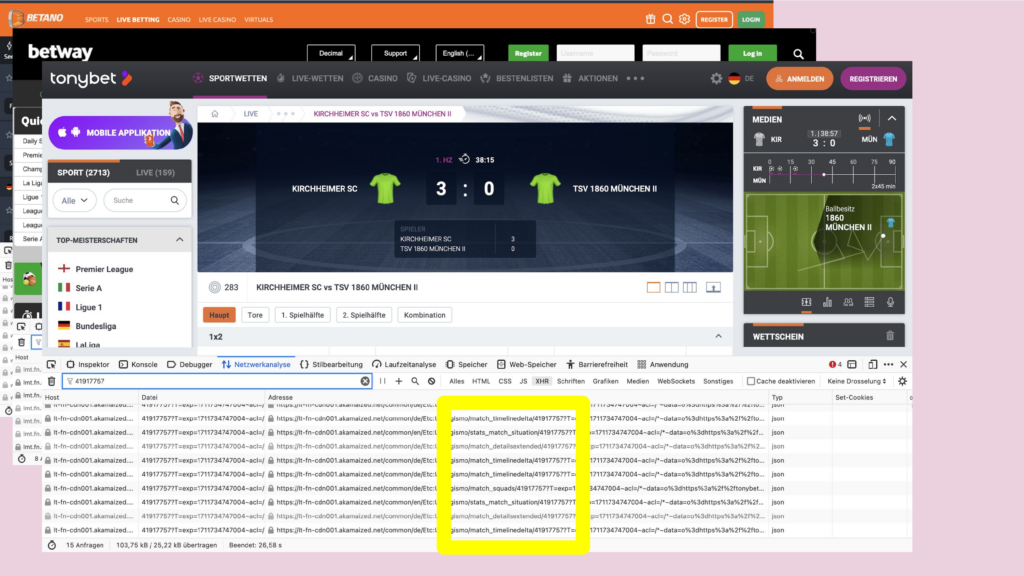
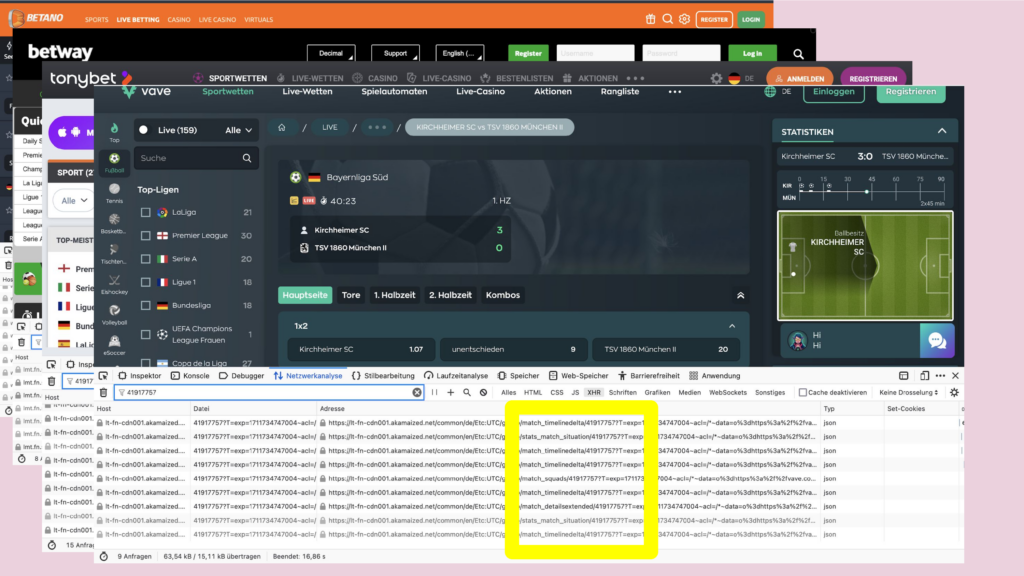
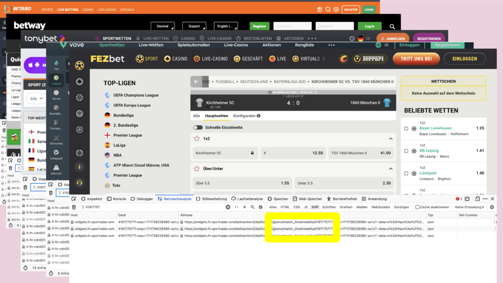
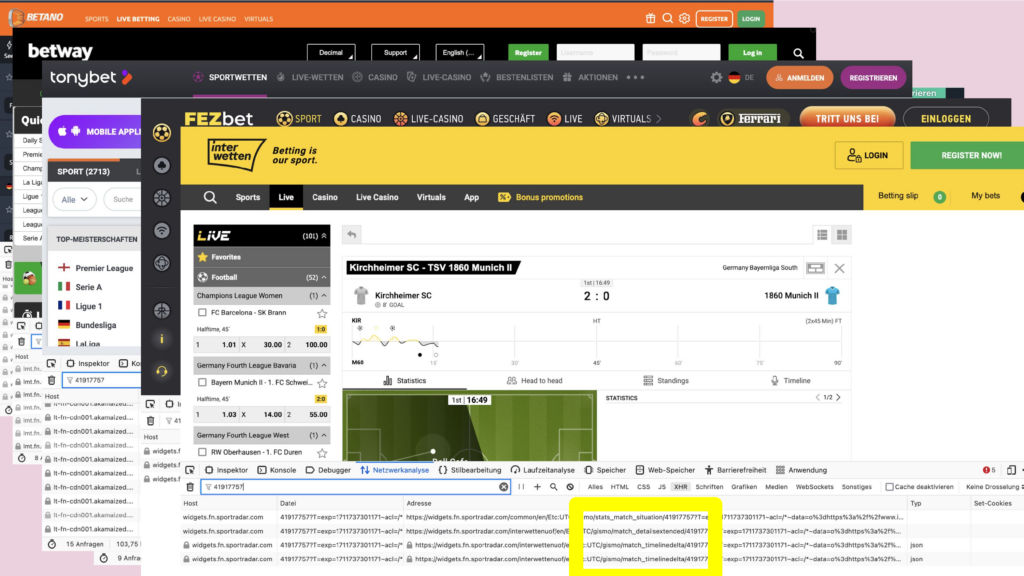
What do you do if you want to know where data on a website comes from? You click right, and open the developer tools. There you monitor the HTTP requests. And on many websites I found the same IDs for the same match – and same API endpoints, even thought deployed on multiple URLs. In some of those URLs there is the name of a company, that is a big player in the field of sports data: sportradar.
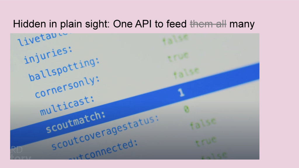
I inspected the data on these endpoints and what I found were fields that have names like: scoutmatch or scoutconnected.
We already knew that data scouts is the name for the people standing at the playing field and collecting that data. The API gave us more information: Now we knew for every match a few days in advance, if a person will be at the playing field to collect data. And on the match day we, we could observe, those people connected to the internal Sportsradar systems – typically a few minutes before the game starts.
This was very crucial information for our documentary. You can find it in the ARD Mediathek, by searching for „Angriff auf den Amateurfußball · Die Gier der Wettindustrie“.
- TV documentary: Angriff auf den Amateurfußball · Die Gier der Wettindustrie
- tagesschau.de: Das fragwürdige Geschäft mit dem Amateurfußball https://www.tagesschau.de/investigativ/br-recherche/sportwetten-amateurfussball-100.html
Let’s head to the third and last story …

If you will this is a rather classic example of data journalism: a big pile of data – and I have to make sense of it.
This story was a cooperation with Netzpolitik.org. Sebastian Meineck from Netzpolitik.org came to us with more than more than 300 GB of plain CSV files. He got them from a data broker as a free sample.
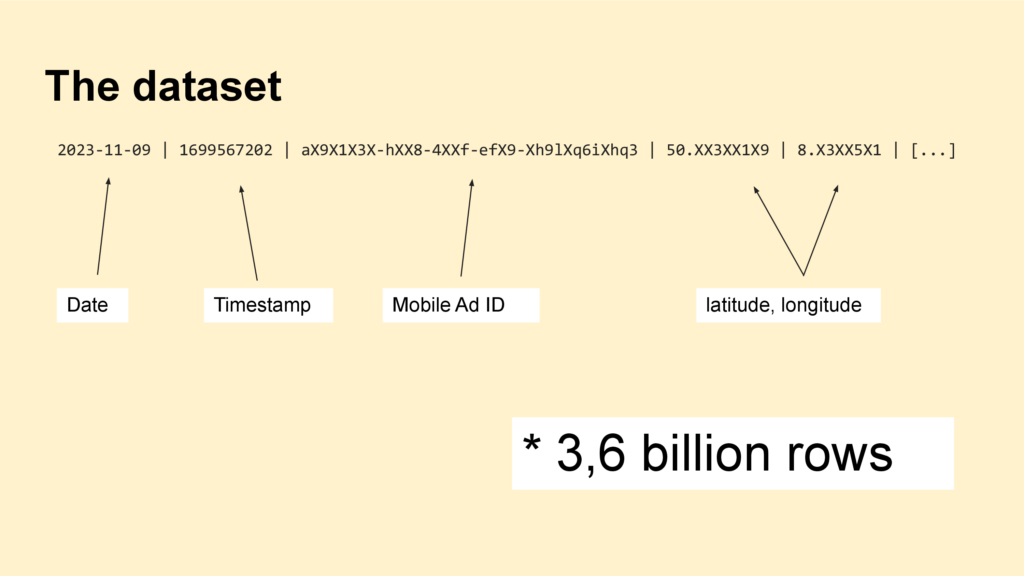
If you open a file, one row of data looks like this: You have a date, a timestamp, a mobile advertisement id – basically a unique identifier for devices like smartphones – and we have coordinates as latitude and longitude.
First, what are location data? GPS Positions of the smartphone. And since we all carry phones with us all day long, they are the movement profiles of humans.

We are not interested in the daily lifes of random people. We are interested in the journalistic relevant ones, especially those who have access to buildings that are relevant for national security.
How can I find them?

For example a person from Berlin who is working in a high-ranking position in a German ministry.
We can see that this person was at several train stations, in the German parliament, at a cinema, in restaurants.

If I zoom out we could see even more: Where the person lifes and works, where the person spends the free time.
We contacted the person and the person confirmed the data.

But we can’t inspect millions of profiles by hand. We need some sort of filtering. This is where the Open Street Map came in handy.
Coordinates are just numbers with many digits – they say nothing what there is. The OpenStreetMap gives this context and transforms the raw data to information. For example, on the screenshot you can see the Bundesnachrichtendient in Berlin, the foreign intelligence service. I can download that orange line as a polygon.

This is something I used extensively. For example, here you can see all military areas in Germany, that are currently in the OpenStreetMap. I downloaded them and then I queried the location data in a DuckDB:
For each of the 3.6 billion rows I asked if it’s within one of those polygons. You can imagine, that this query took some time…
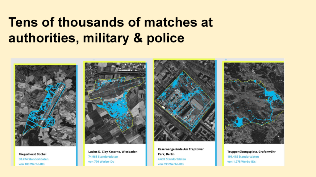
This way, we found tens of thousands of matches in security relevant areas.
Two examples:
We identified a person who is working for the Verfassungsschutz.
And we found another person who is connected to the US army and frequently visits a building at the Bundesnachrichtendienst in Bad Aibling. We know from the Snowden documents that this building was called “tin can” and was used by the NSA for internet surveillance.
- Under Surveillance: How Location Data Jeopardizes German Security
- tagesschau.de-Podcast 11km: Investigativ-Recherche: Wie Handy-Daten zum nationalen Sicherheitsrisiko werden (German)
- netzpolitik.org: How data brokers turn our privacy into money and jeopardise national security (English)

Let’s come to some sort of conclusion. What do the approaches have in common?
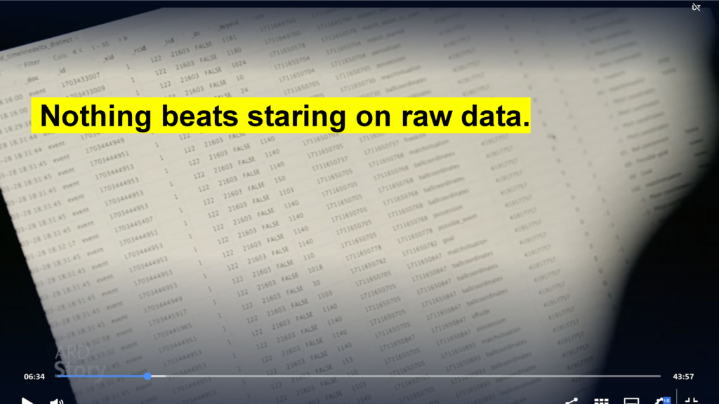
Investigative Journalism is inherently qualitative work – even if it’s relies heavily on data pipelines and automation and coded analysis.
Therefore, understanding individual cases is crucial. And nothing beats staring on raw data for this.
Also, I never trust the data too much. Just like with human sources. For example, we found out that in the location data the timestamp was faked: The days were correct, but the dates we not.
And: I always want to know my missing values: Chances are I find a story there or at least my own mistakes.
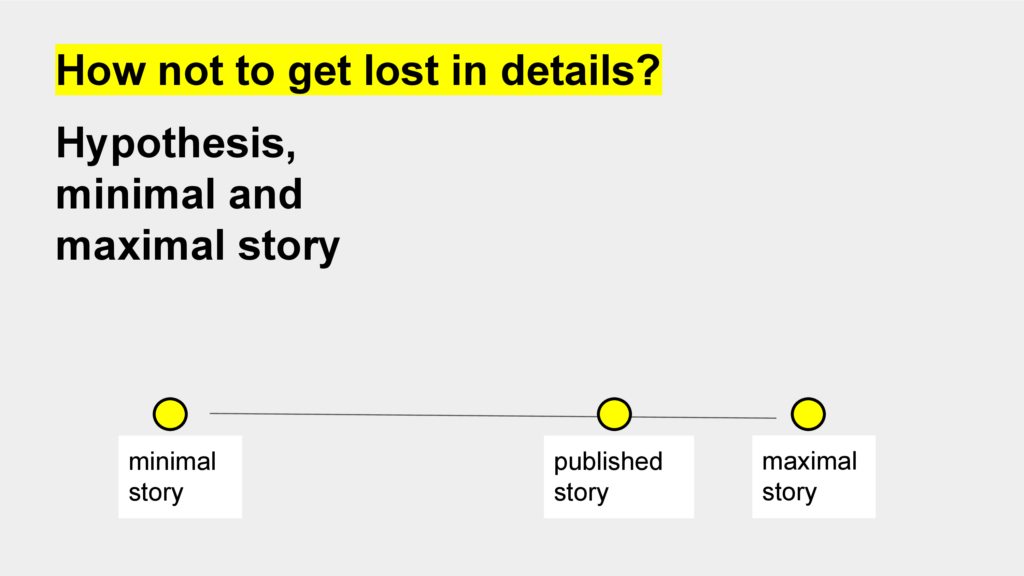
But: There is so much data, dozens of notebooks: How not to get lost in details? Mark Lee Hunter, the one with the investigative journalism bible, proposes a framework with three key concepts. Following a hypothesis and working with a minimal and maximal story.
…
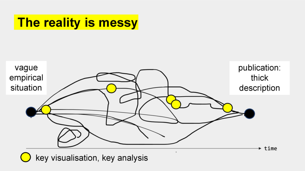
Looking back, the behind-the-scenes stories have a clear narration, a clear path from start to finish – like I did before. But in reality, this is not true – it’s messy. There are dead ends and detours and sometimes something is even way easier that expected. (More on vague empirical situations in Koed Madsen, A. (2024). Digital methods as ‘experimental a priori’ – how to navigate vague empirical situations as an operationalist pragmatist. Convergence, 30(1), 94-115. https://doi.org/10.1177/13548565221144260)
However, one thing is crucial, first for the internal pitching, and later for the publication: Finding key visualisations or key relations for condensing to the hundreds or even thousands of lines of codes.
And one last note: Investigative journalism is a team sport – and the data part is just one many roles.
- Find all stories on br.de/data
- Whitepaper from BR AI + Automation Lab: „Blackbox Reporting: How Journalism can report on AI and algorithms“
Ein Kommentar